
Vector and Raster Artwork? What Is The Difference?
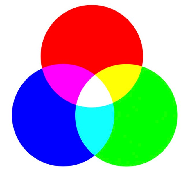
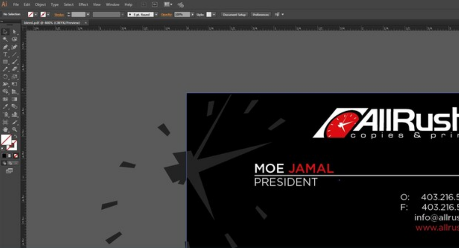
At AllRush, we work with all types of files for print production. We receive artwork files that are thought to be high quality, print ready files, however, some are not. The most common issues we find are the challenges between converted files from vector to raster or vice versa. This article will help inform and explain the differences between the two types of graphics and their most effective uses. Defining Graphics Vector graphics are composed of mathematical equations to form geometric shapes such as points, lines, curves, shapes and/or polygons. Each graphic is controlled by a point or node that accurately determines the direction of the pathway as it connects to multiple points or nodes; forming a single shape or line. It stores the information of its x and y positioning along with its assigned properties (colour, stroke thickness, fill, etc) to create the desired image. Vector graphics maintain a cutting-edge appearance and can be easily edited, and resized to any dimension without hindering the quality/resolution. Especially when it comes to making modifications, rearrangement, or just minor tweaks; it becomes easier and quicker to execute those using a design software. Ideally used for logos, infographics, icons, graphic illustration or promotional material. Raster graphics (also known as bitmaps) are not made out of geometric shapes; instead, they use what is called a dot matrix data structure. Basically, they are a rectangular grid of tiny squares most commonly known as pixels. Each pixel represents a single color value to define the image. Raster graphics may be restricted by its determined height and width. It can beautifully capture realistic imagery and photography. With various color information stored in each pixel, it can be quite challenging or difficult to edit these images, let alone resizing them. Quality will be affected here. Ideally used for photography, photo-realistic imagery, or multiple variations of colours (such as gradients). Two of the same words that look the same Close up to reveal the difference How Do I Know If The Files Are Workable? It can be tricky to tell if the file is workable or not since they may look the same on a screen. But when it comes to print, it’s a different story as it requires high quality images and/or vector artwork to produce crystal clear quality imaging. Here are some examples of knowing the difference: Commonly Known File FormatsVector File Formats: .AI, .EPS and .SVGRaster File Formats: .PSD, .JPEG, .PNG and .GIFImage Quality (For Raster) PDFs PDFs may be challenging to show if some images and/or text are in vector or raster. There are some ways to tell by simply zooming in closely at the page. Vector will maintain its sharpness as it can be easily editable. Raster will simply pixelate as you zoom in, thus limiting editing option. Not all raster image/text are not quality worthy, some are able to print just as near-perfect as vector. Ideally, vector files are the way to go as they constantly maintain sharp, high quality graphics no matter the size or adjustments. A change in its attributes simply means recalculating the mathematical equations. It requires little effort for modifications or reuse for future purposes. This doesn’t apply to realistic or photographic imagery since they are raster. For raster images, the quality is determined by its resolution, known as dpi (dots per inch) for print, or ppi (pixels per inch) for digital screens. The most preferred resolution for print would be 300dpi, however if the image is scaled lower, the resolution increases. For digital screens (tv, monitors, cell phones, etc), it would be 72ppi. Scaling up however will decrease the resolution; resulting in the loss of quality. At AllRush Copies & Print Services, we have a full design team ready to assist and guide you through your design requirements. Creating or converting artwork to the highest quality for both print and digital use is never a problem for our highly skilled team. Contact us today and a representative will assist you!